Playersroom and Playersroom kids
social media redesign
Sports store company│Agency: Growww Digital│Year: 2021
Today it is quite essential for most brands to have a proper unified visual identity on their social media page to achieve effective communication to the target audience. Also, from time-to-time, all these brands have to update their communication style and their design to meet current trends.
For this project, my role was to make a skeleton for a design system with some examples and provide it to the social media manager who is going to use it on daily bases. For this reason, during my design process, I have kept in mind that the structure that I had developed had to be easy to modify and handy to use for everybody.
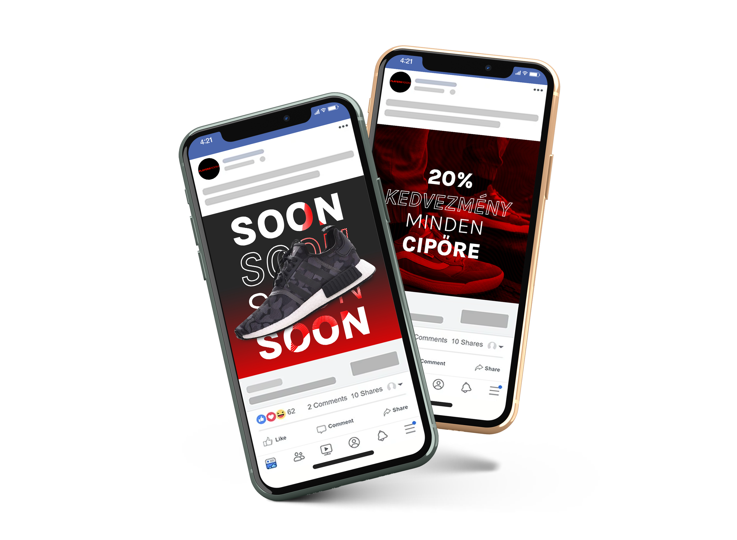
Final design.
─ Playersroom ─
I checked out the brand’s previous communication and also saw what their competitor’s communication looked like and what the design trend in that field was. My conclusion was that I had to make a more masculine design that is easy to associate with the brand.
─ Design elements ─
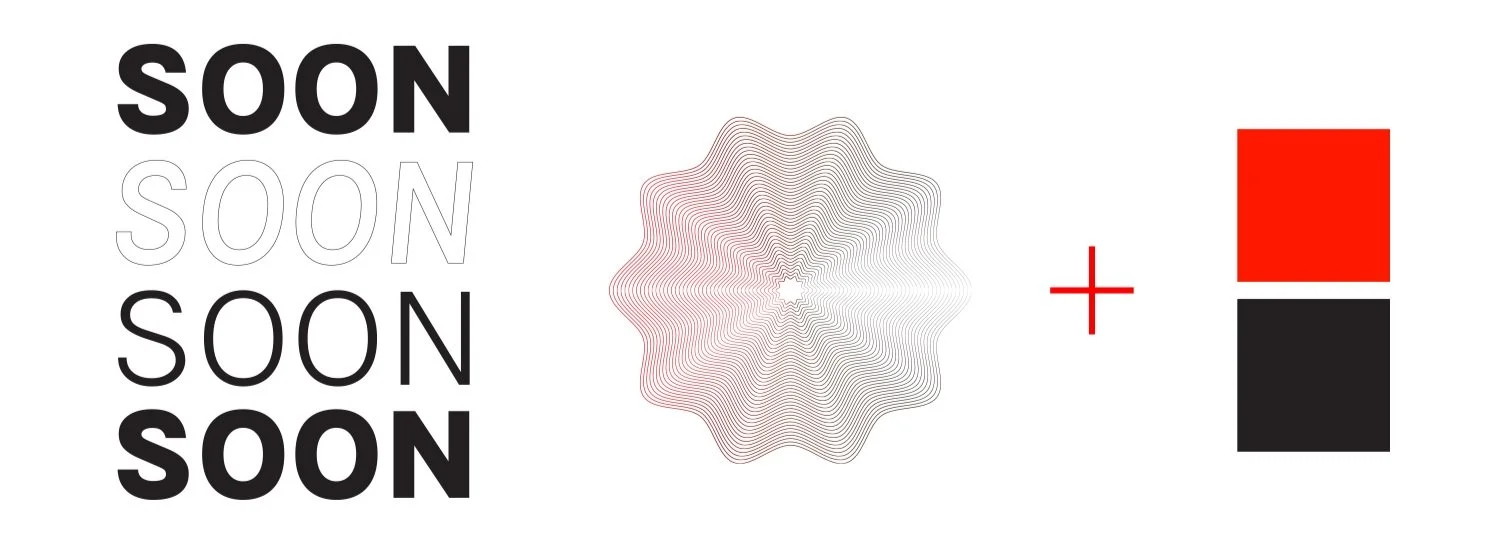
If the brand has a well-organized design structure it's much easier to deliver a message in the most impactful way possible.
Text style + pattern style + the brand main two colors
─ Concept ─
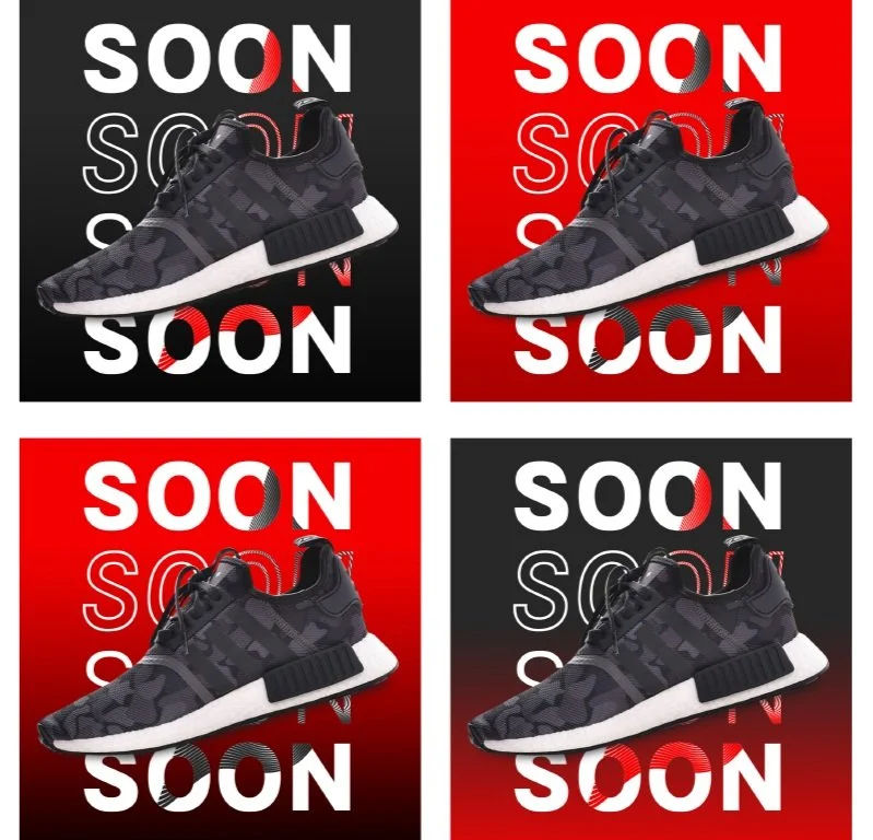
Teaser post
The two background colors are the basic colors of the Playersroom or gradients of it. There are several options for the background color to choose from to match the new product.
Promotion post
For the promotion post type, I used a red filter with the specified pattern and added the text, where the concept is the text always had to be in 4 rows.
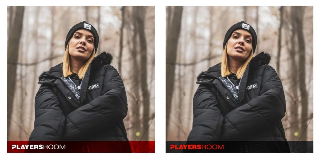
Post frame
Depending on the picture in use, I made 2 types of post-frames.
─ Other design ideas ─


Final design.
─ Playersroom kids ─
For their sub-brand redesign, I used the same design method, the only difference was that this design had to be more playful but it had to fit to the main brand design.
─ Design elements ─
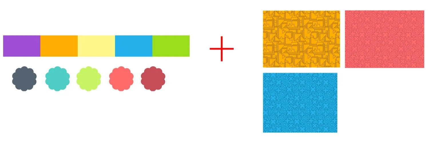
To make it more playful I used brighter colors and I searched for different types of patterns which I changed to monochrome.
(Credit for the patterns: www.pixabay.com)
Colors + pattern
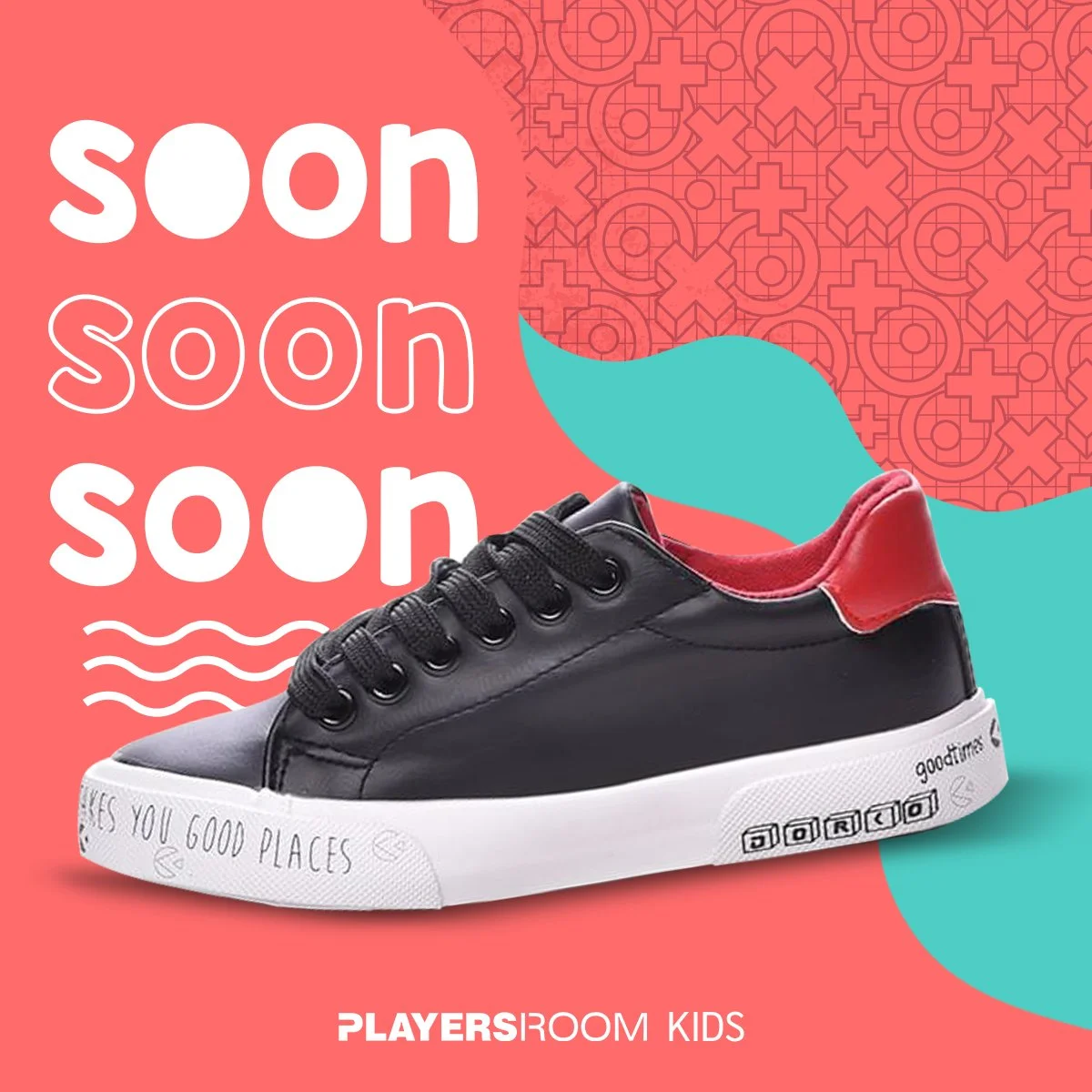
Teaser post
The basic idea is that there are always two colors in the background. The arrangement of the colors, pattern, and wavy shape changes with each post.
Promotion post
I used the same mindset for this part, adding the pattern and the color filters. To make it more lively the concept here is to use different colors for each post.
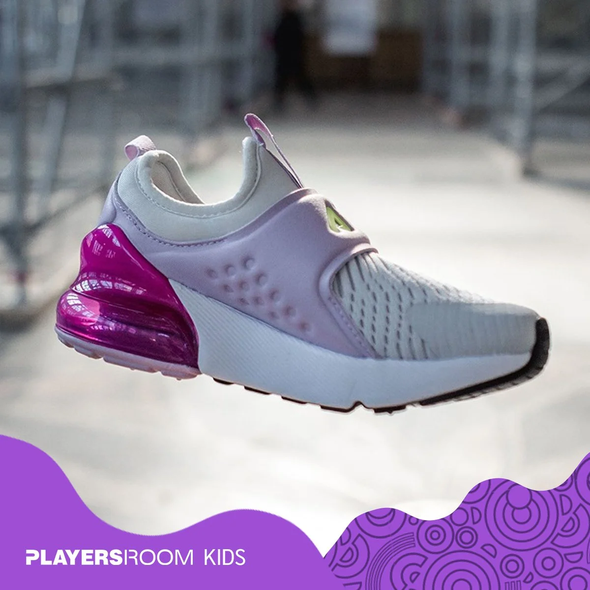
Post frame
Depending on the color of the product the frame can be changed and with the varying waves and the different patterns, it could be different in every post.
